
Resonus
Communication Platform for Communities and Their Local Government
What is Resonus?
If Resonus isn’t already on your Kansas City tech company watch list, then heads up, because Resonus is all about making waves.
Founded by Mitch Mabrey, Resonus is on a mission to make writing letters to the mayor, attending public board meetings, and calling in government complaints a thing of the past.
Using AI, Resonus is creating a platform that collects local communities' thoughts and compiles them to make it easier for government leaders to make the essential decisions people need.
Resonus derives from the Latin word meaning to resonate, and like a ringing bell or echoing sound, Resonus aims to bring people’s voices together to be more efficient and effective.
AGENCY
Preyer Design
Role
Creative Director & Designer
Full Credits
See full credits
The Creative Challenge
The creative challenge for me was to design a logo that combined sound waves with the concept of conversation. This logo will be used by everyday people as well as government officials, and we wanted the brand to look approachable so more people would get involved.
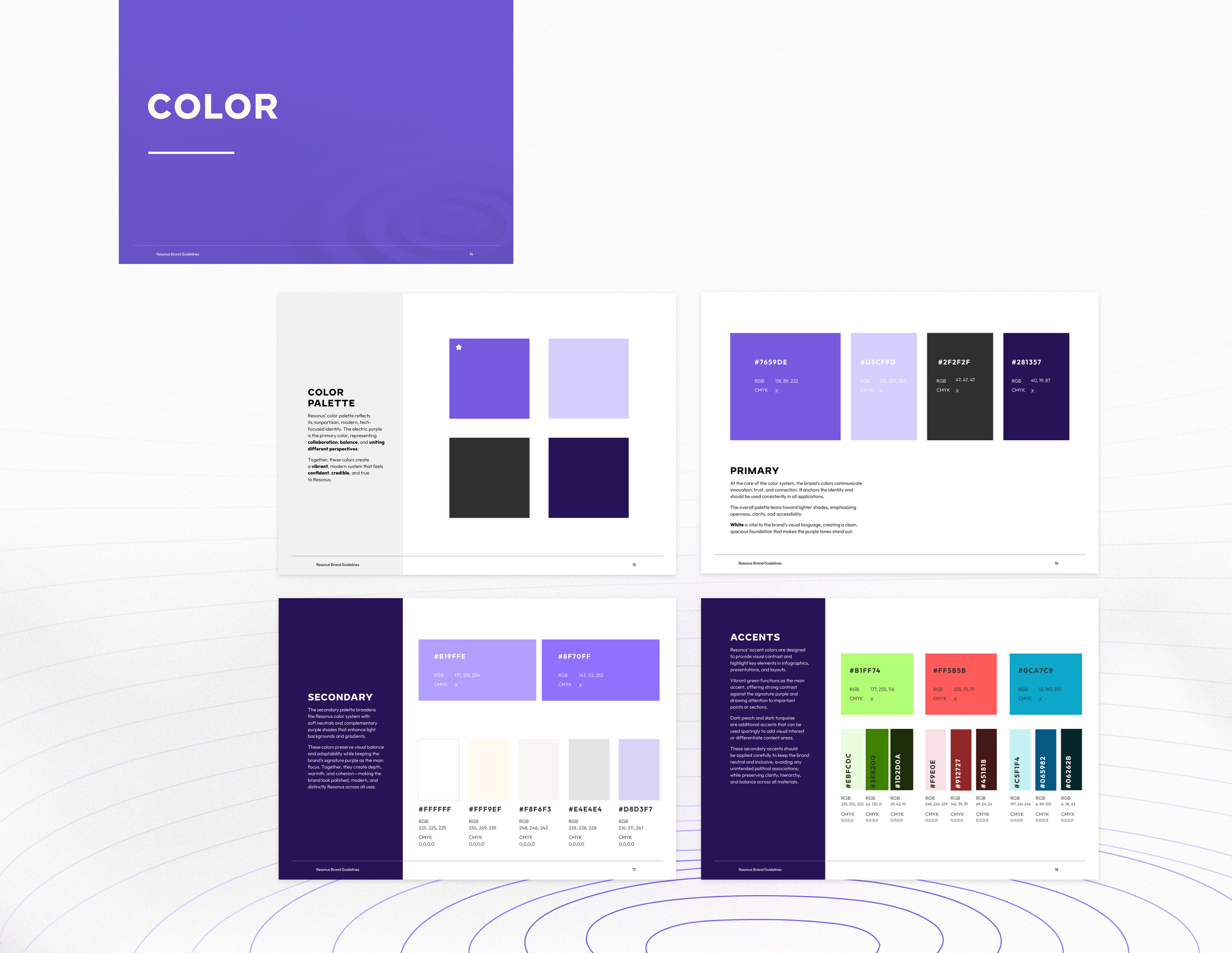
We wanted the overall aesthetic to align with other technology companies by using smooth gradients, clean layouts, and a pop of electric colors.
Given these requirements, we needed to ensure the logo didn’t look like it belonged in the music industry.
Round One: Initial Concepts
More Than One Option, Every Time
At Preyer Design, I don’t believe in offering just one logo. Why? Because great design deserves exploration. I’ll give you multiple strong concepts so you can see the possibilities and be part of shaping your brand’s future.
This isn’t common in the design world—but I’m not here to do things the easy way. Each option I present is a concept I truly believe could work for your brand. Anything that doesn’t make the cut? You won’t see it.
Think of it like shopping for cereal: if the store only had one box and told you it was the best, how would you know for sure?
Multiple options let you compare, consider, and choose what truly fits your brand. That’s the premium service my clients get—and the reason they always feel confident in the direction we take together.
Option 1
Didn’t Make the Cut Because:
Appeared to be associated with the music industry
Option 2
Didn’t Make the Cut Because:
Compeitiors also use a logo that has overlapping chat boxes.
Option 3
Didn’t Make the Cut Because:
Appeared too dark
Option 4
Didn’t Make the Cut Because:
Looks more like DNA
Option 5
Didn’t Make the Cut Because:
The client saw a tophat shape, but wanted to explore this concept further with the sound waves going up, rather then down, or perhaps at a 45º angle.
Option 6
Didn’t Make the Cut Because:
Although it is a combination of a chat box, mega megaphone, and sound waves, the client saw a face, which was very distracting.
Round 2
Refining
Going into round 2, the notes from round one were:
The client likes the concept of option 5, but would like to see the sound waves going up or at a 45º angle.
The client would prefer a lighter aesthetic than a dark one.
Liked the weight of the typeface from option 3, but simplified.
Option 7
In this option the client really liked the organin sund waves echoing up and down, so we kep that as our primary brand element.
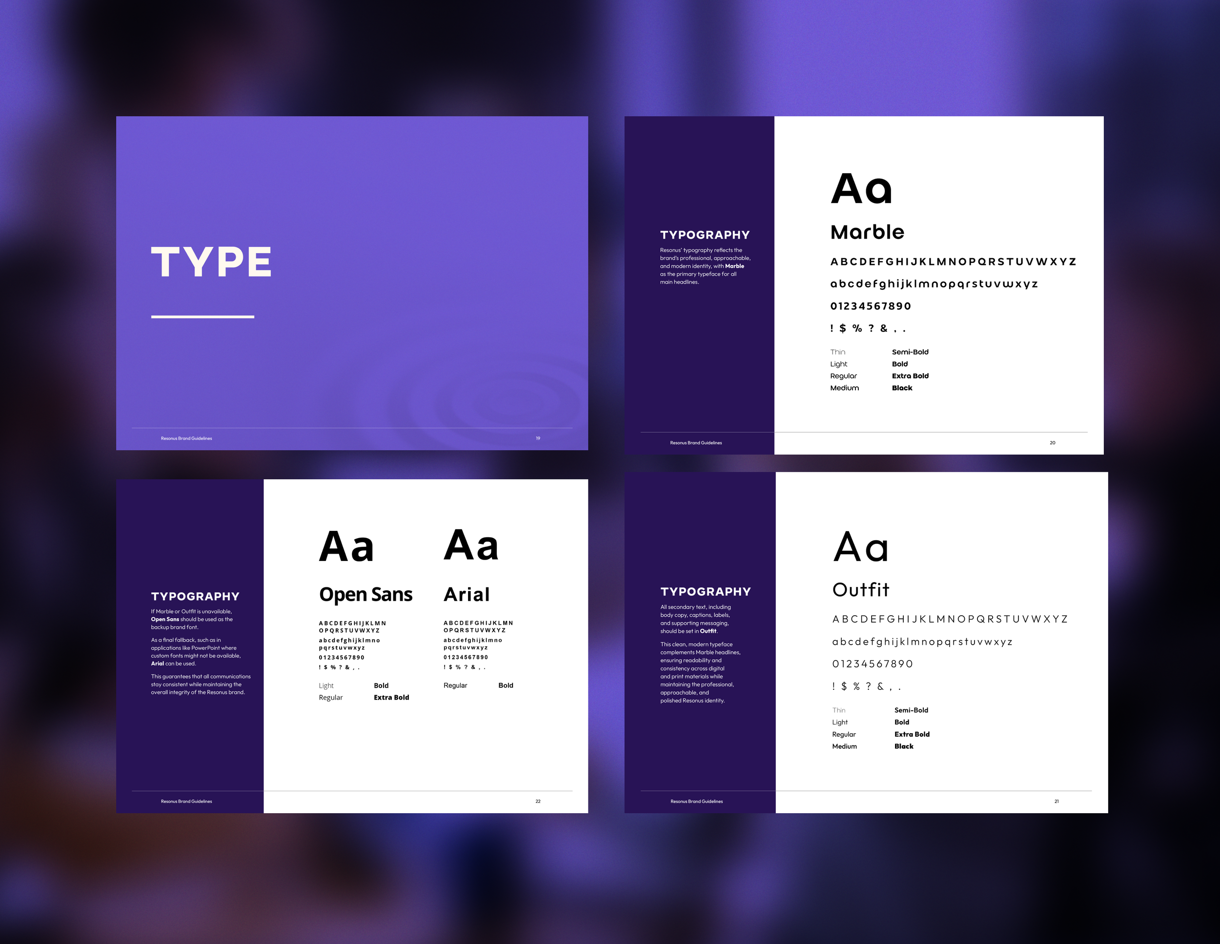
The typeface, Marble, was also kept as it bold, and easy to read at any scale.
Option 8
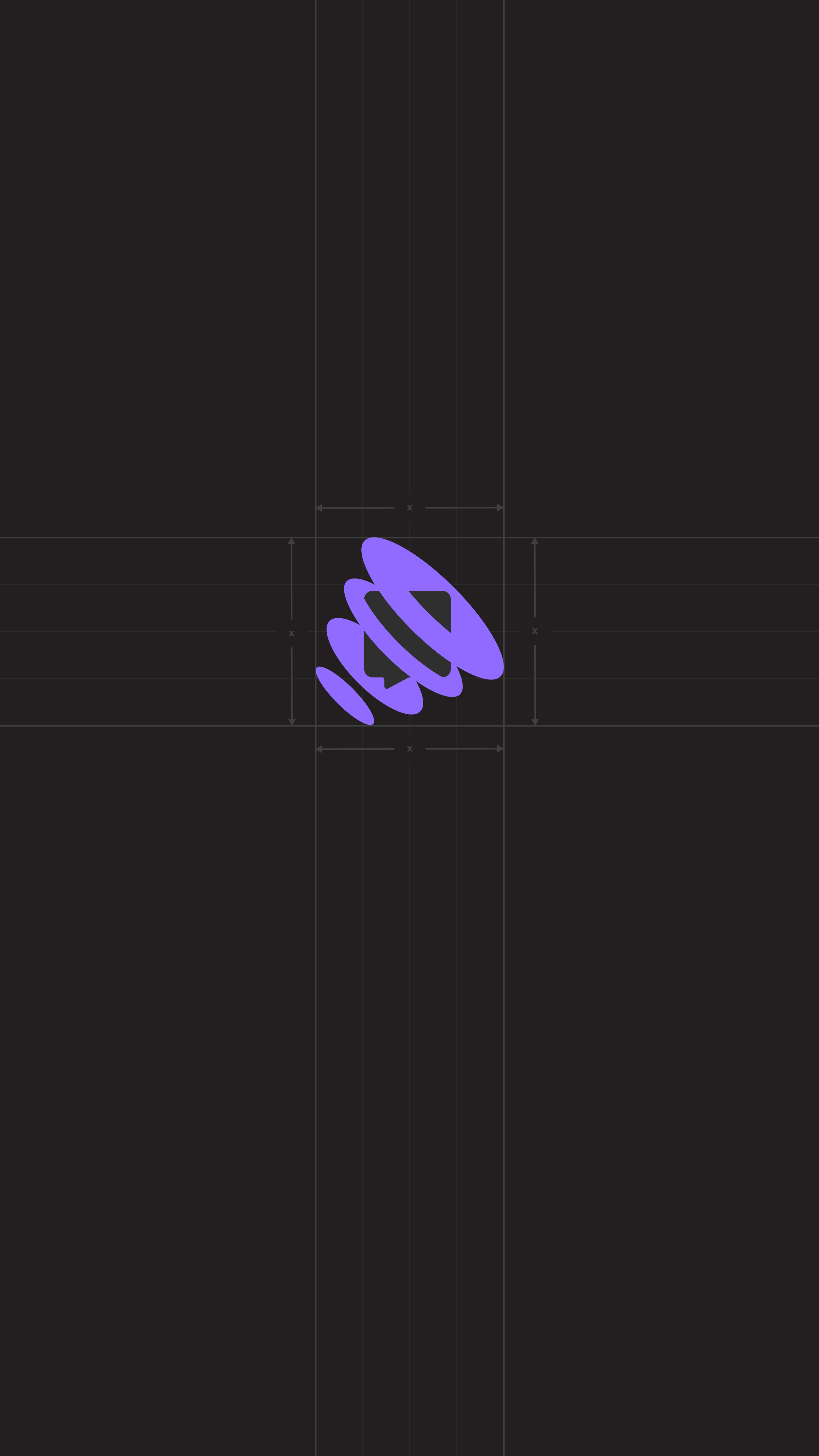
The logo is the one the client selected and I agree, I like this one too. We both like how the sound waves appear going out, and the tip of the chat bubble doesn’t create as much of a tagent in the negitive space.
The colors are inviting and bold.
Round 3: Perfecting
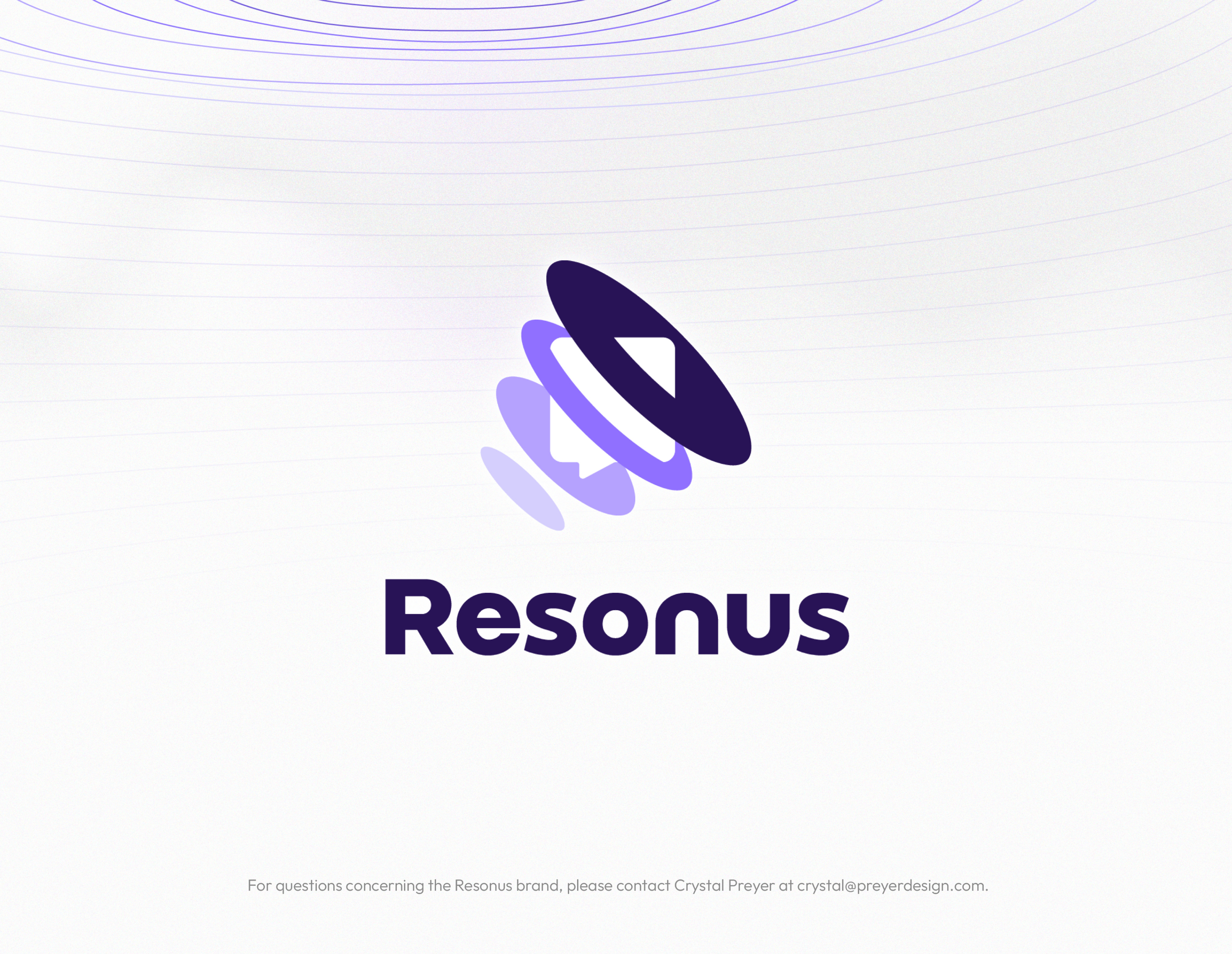
Resonus Logo
Round 3 was really taking the things the client loved most and wrapping them all together.
The emblem and colors from option 8
The typeface and sound waves from option 7.
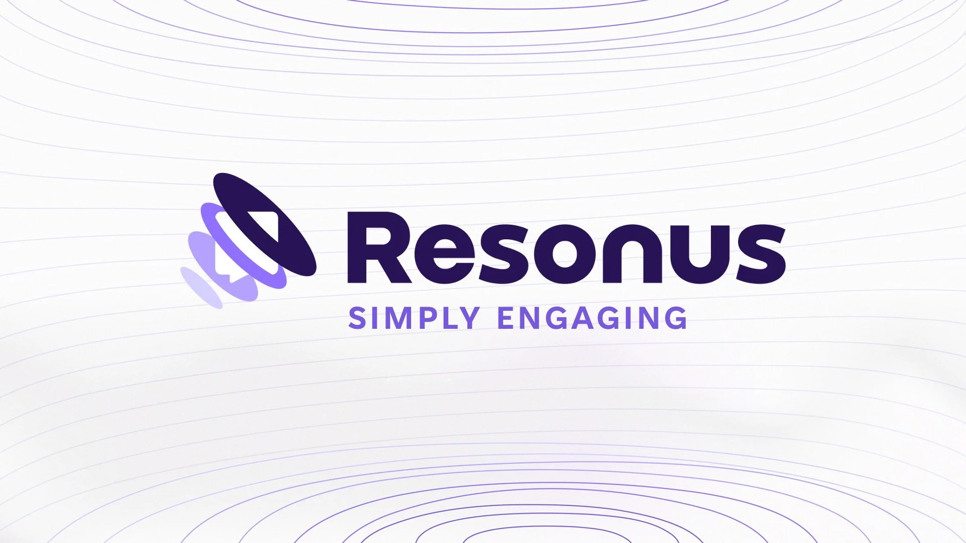
The Final Result for the Future of Resonus
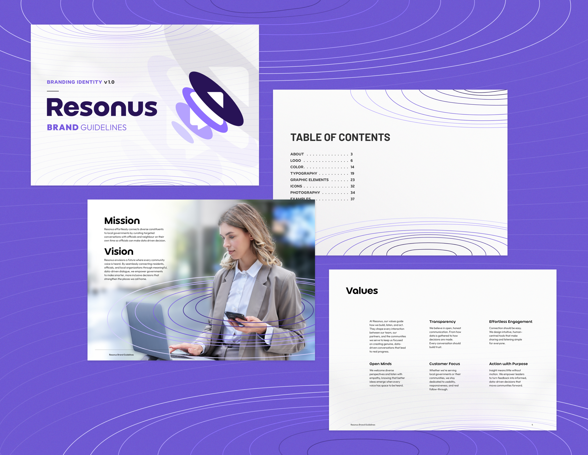
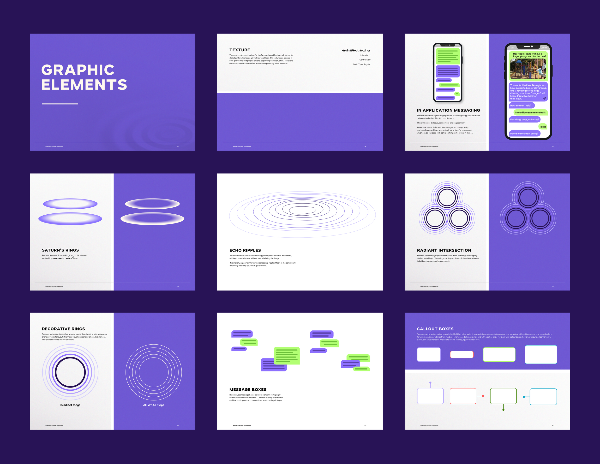
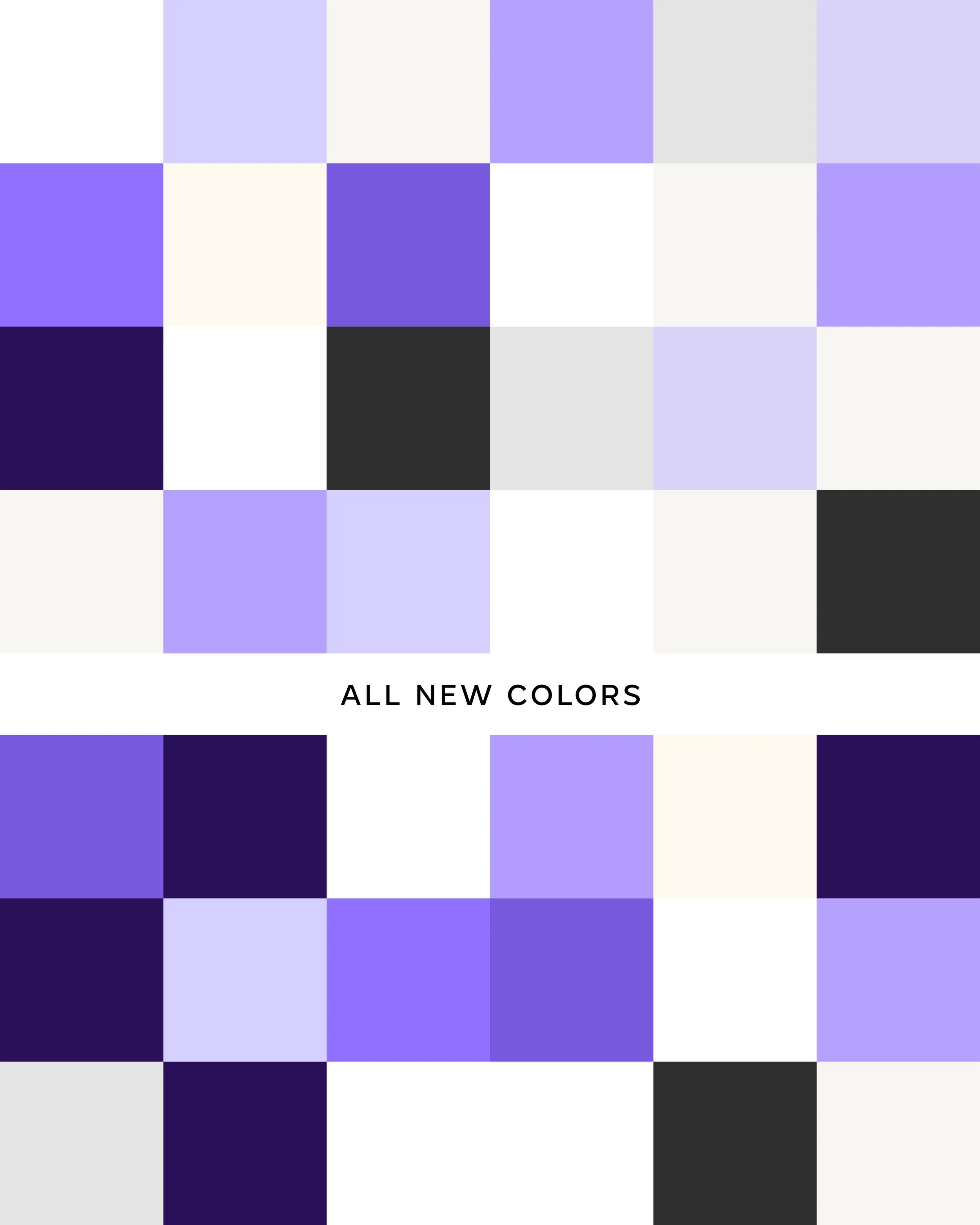
Brand Guidelines
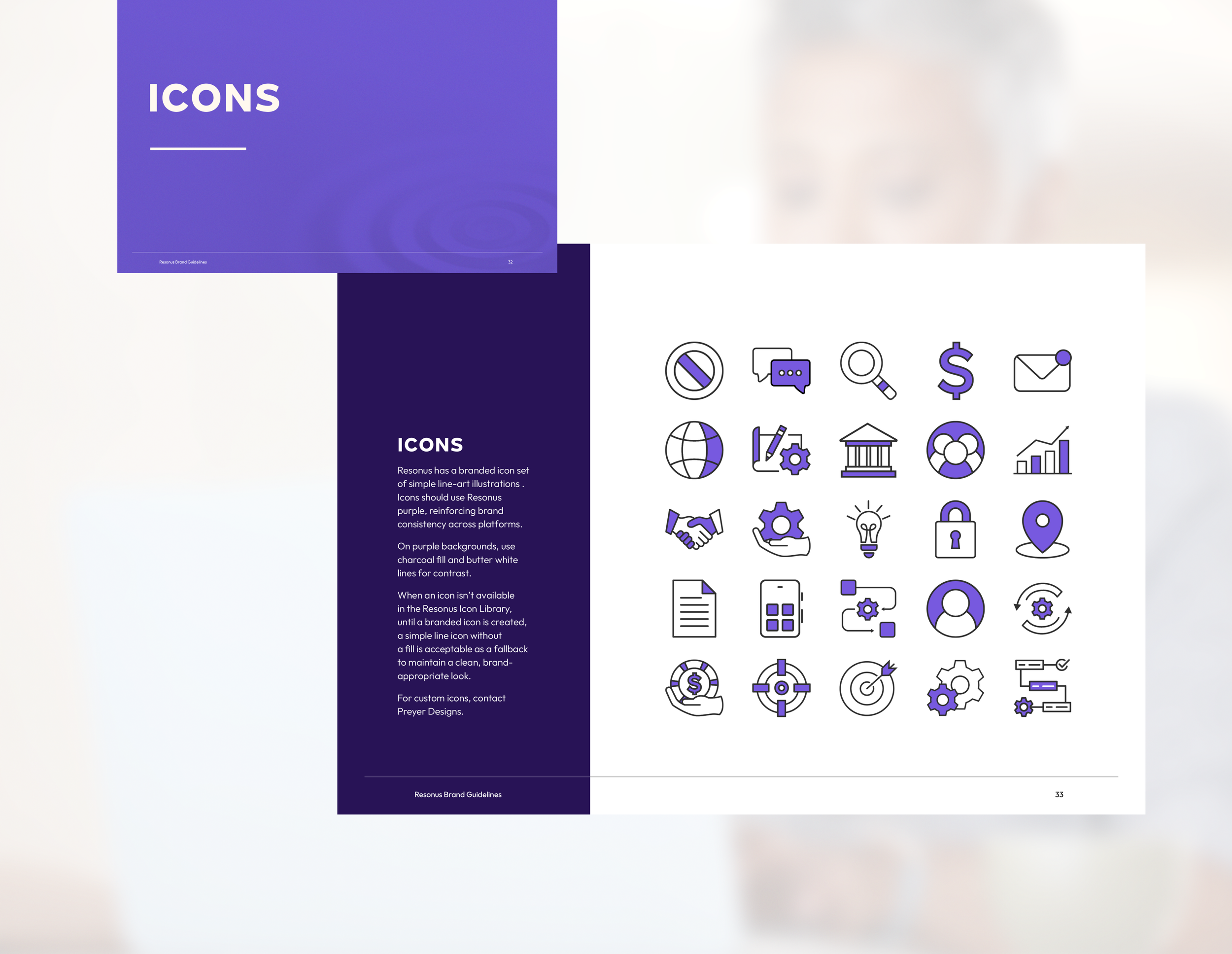
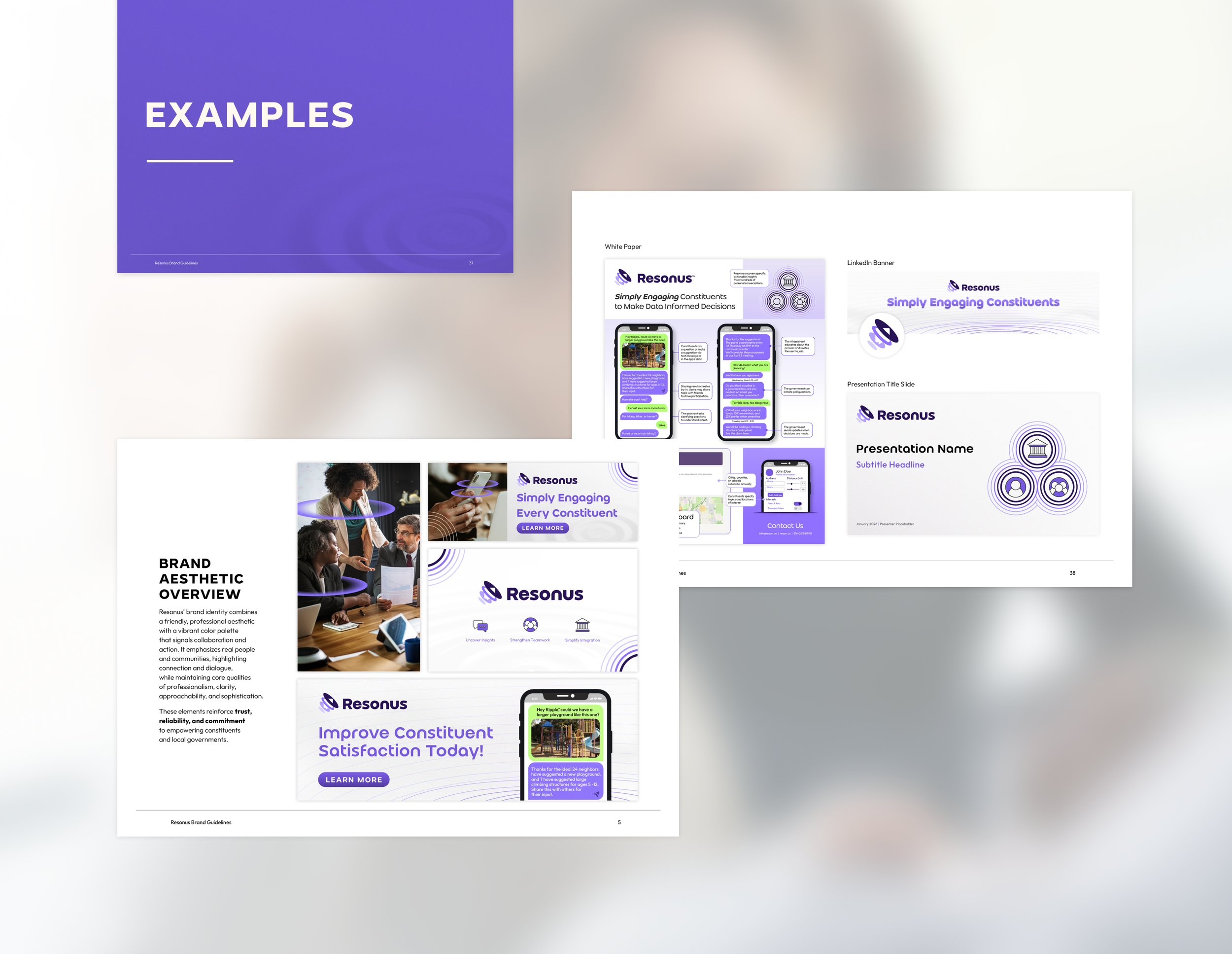
Of course, a logo is only the tip of the iceberg when it comes to branding, so here are the brand guidelines that package up the visual rules.

Before and After
Logo
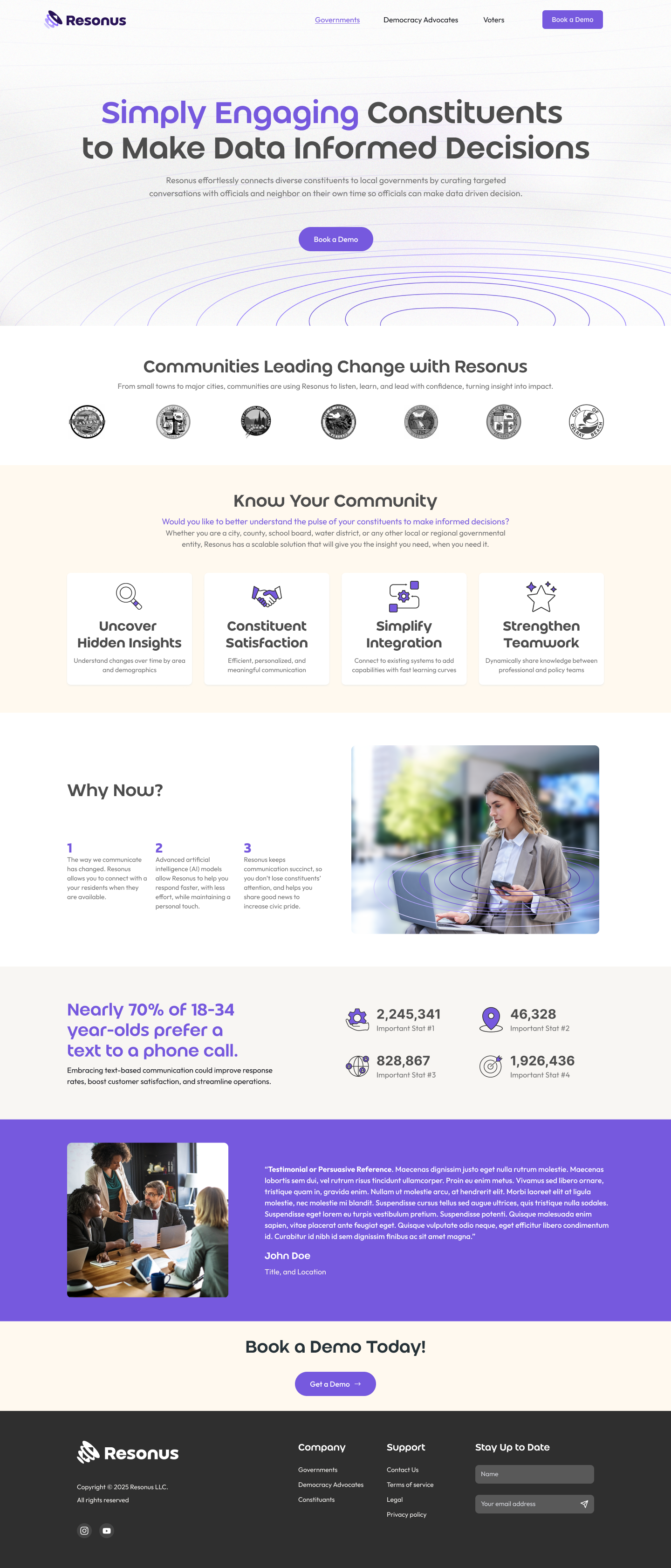
Website

White Paper
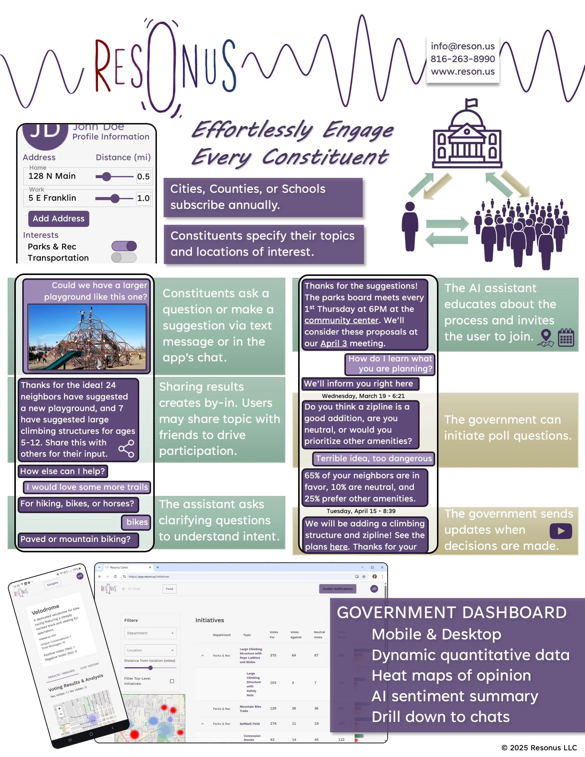
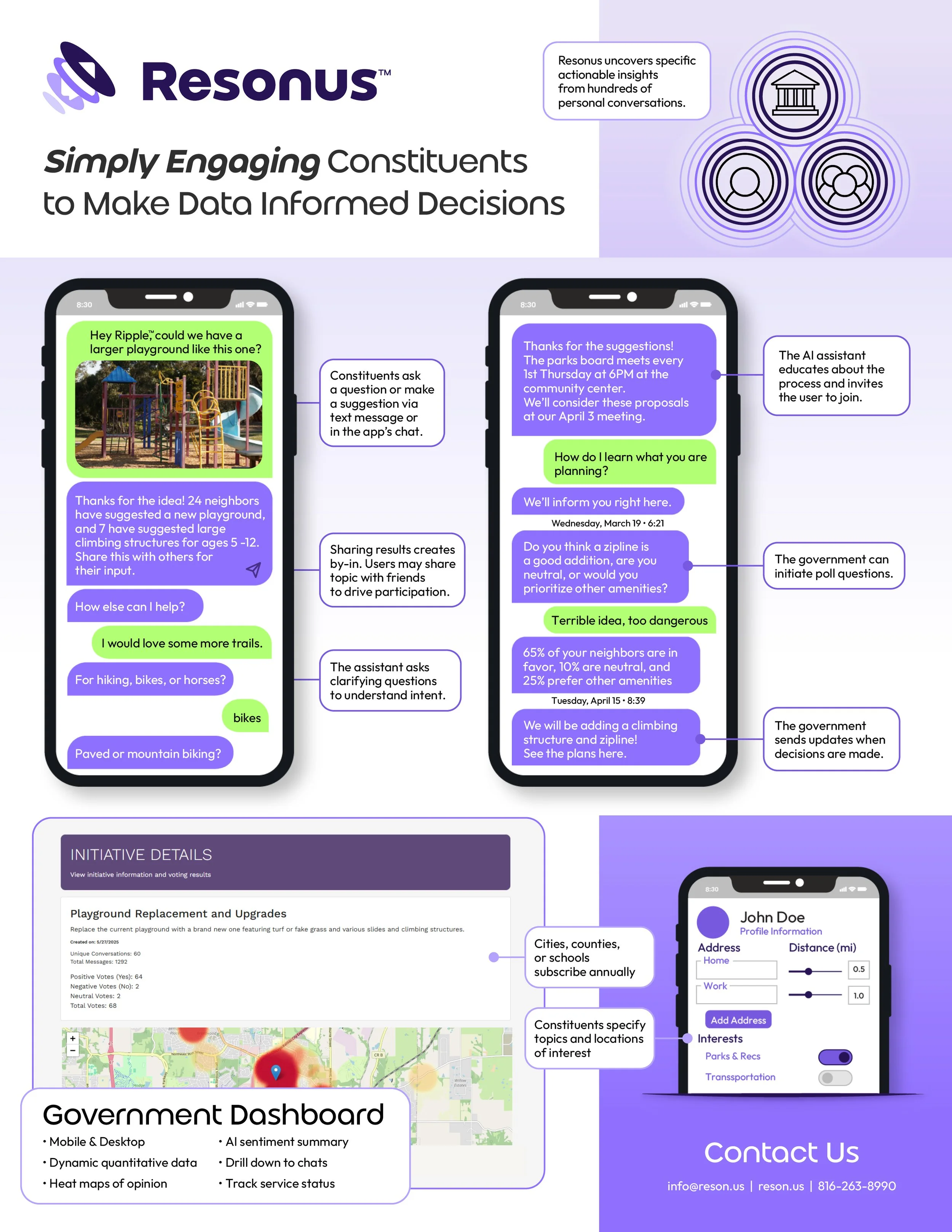
PowerPoint Cover

Teaser Campaign
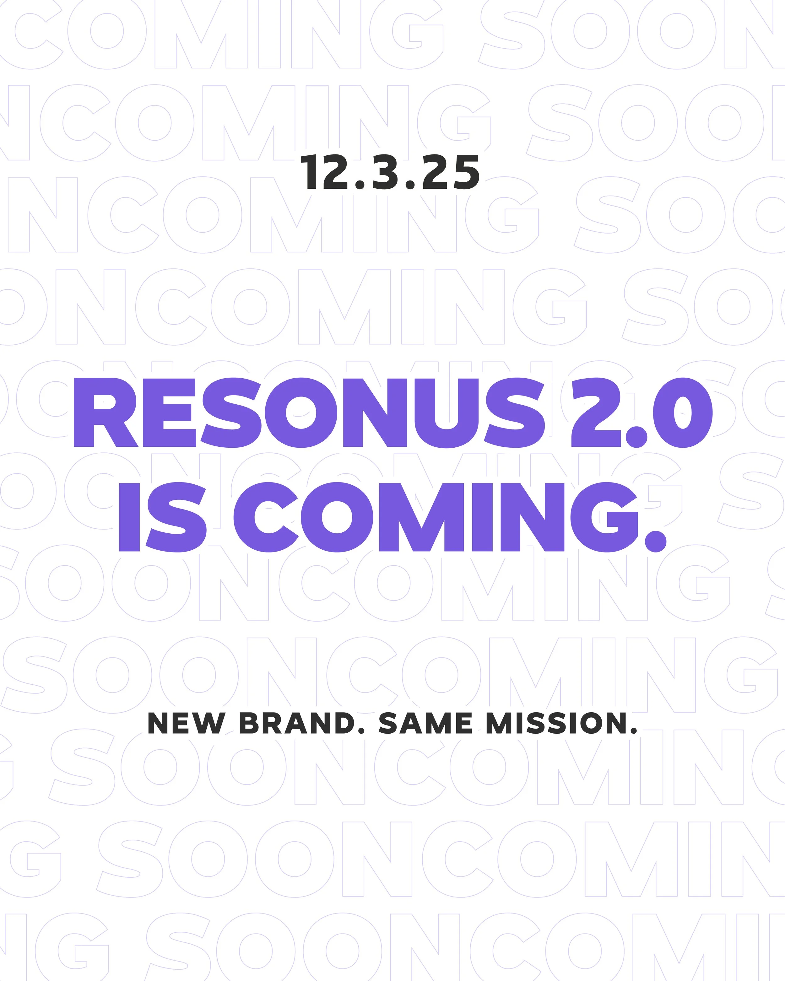
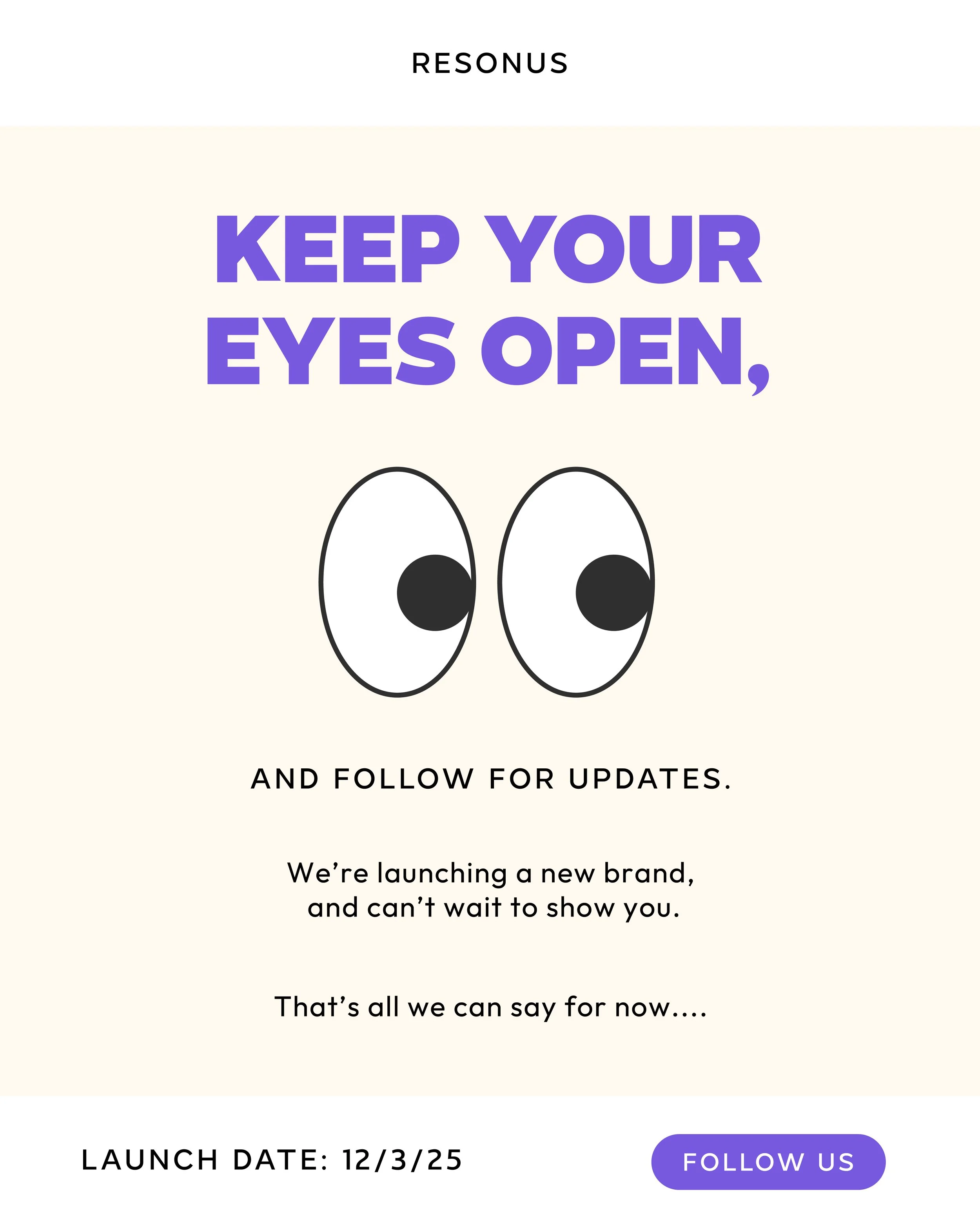
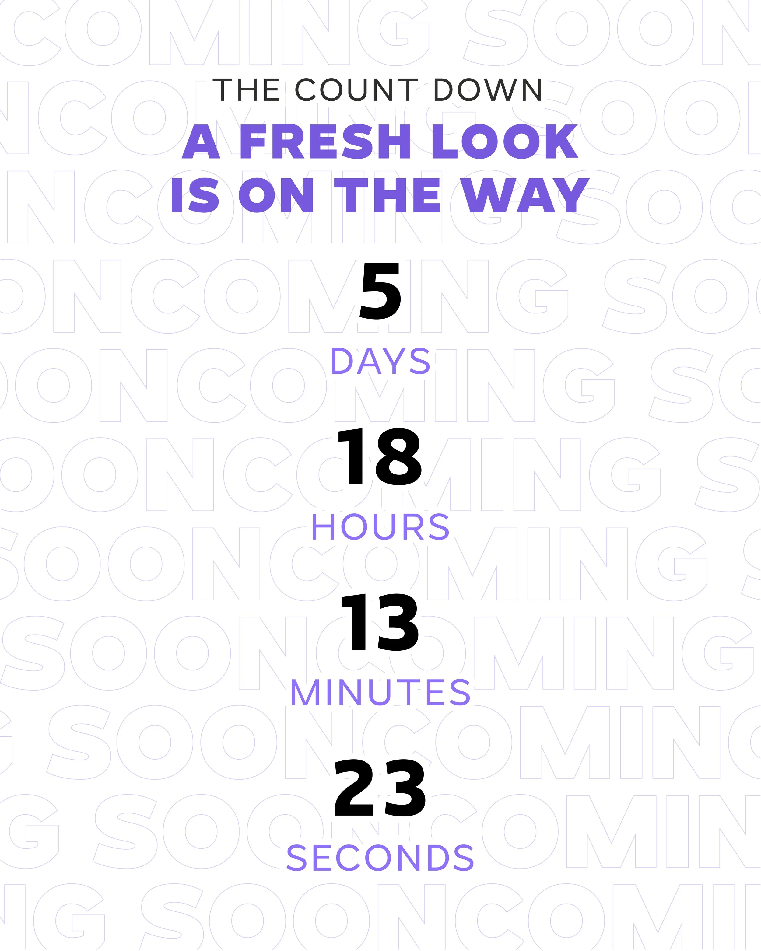
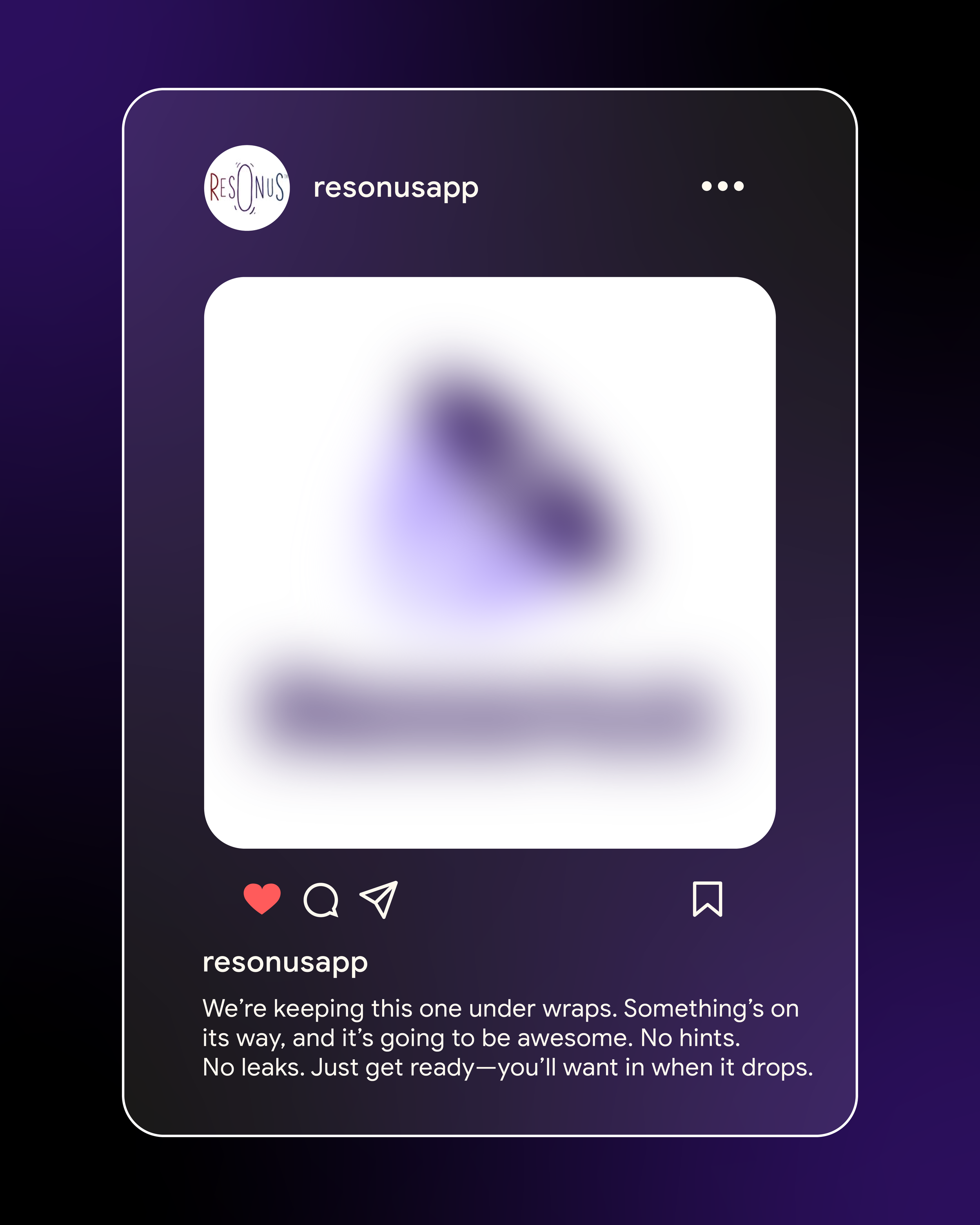
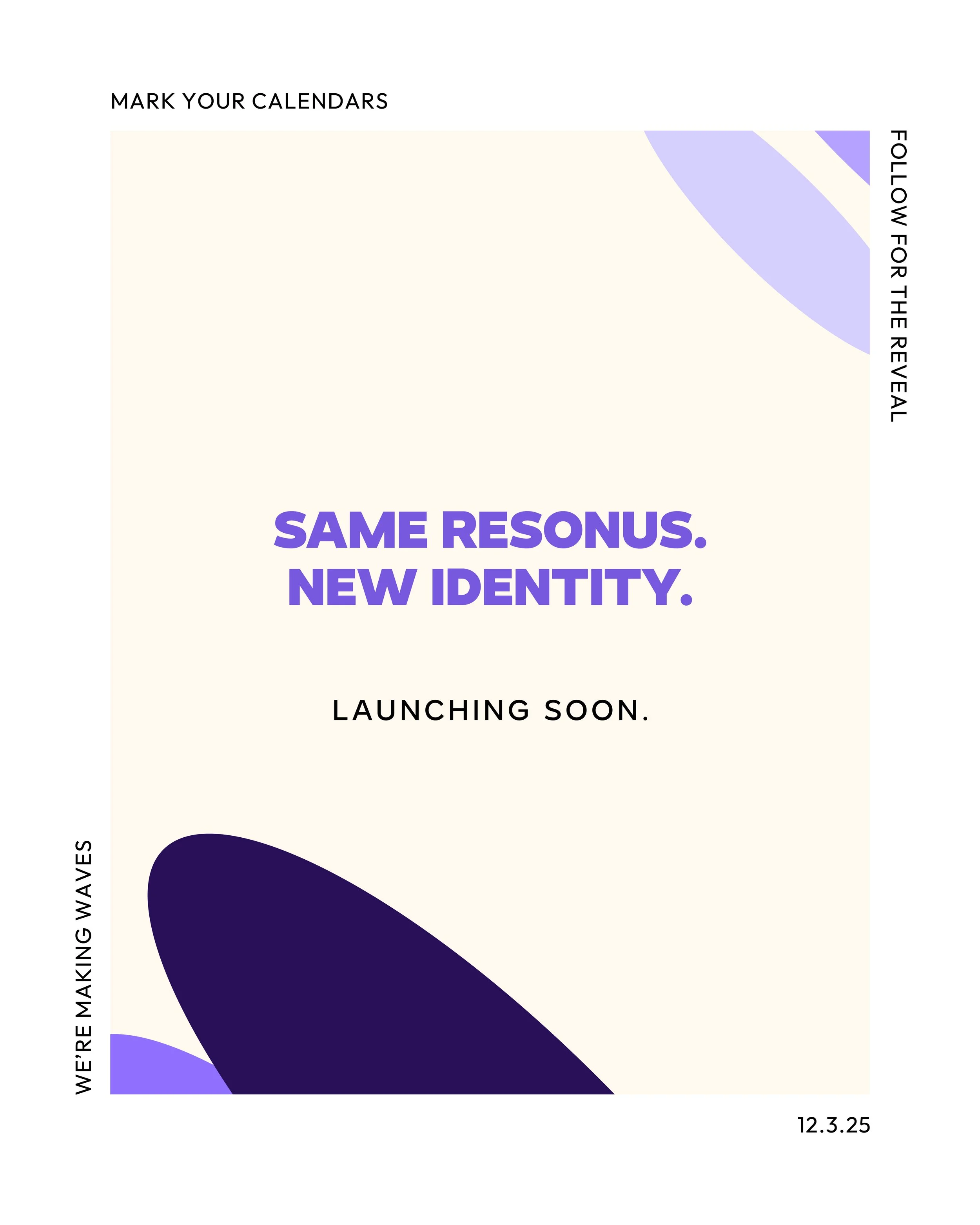
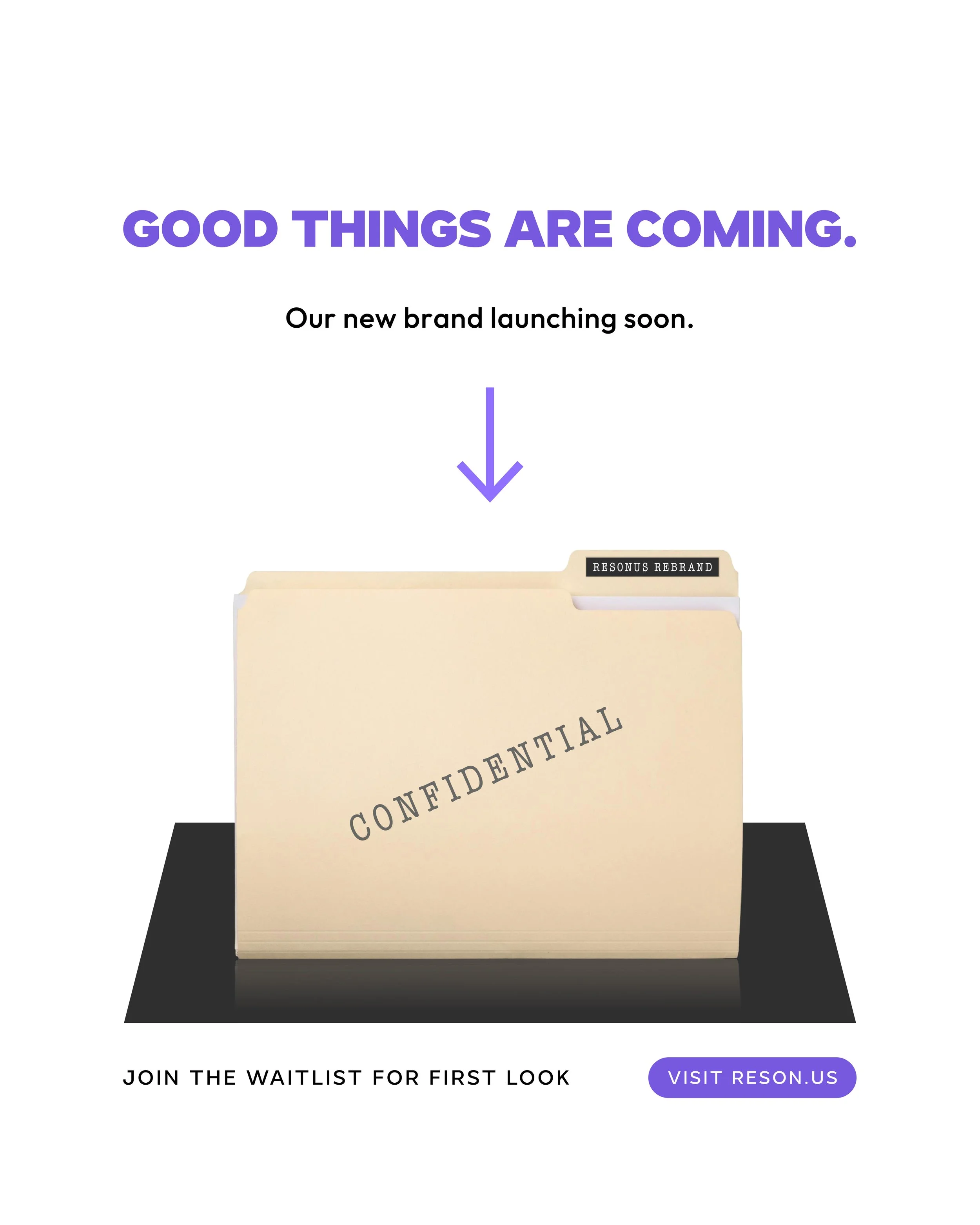
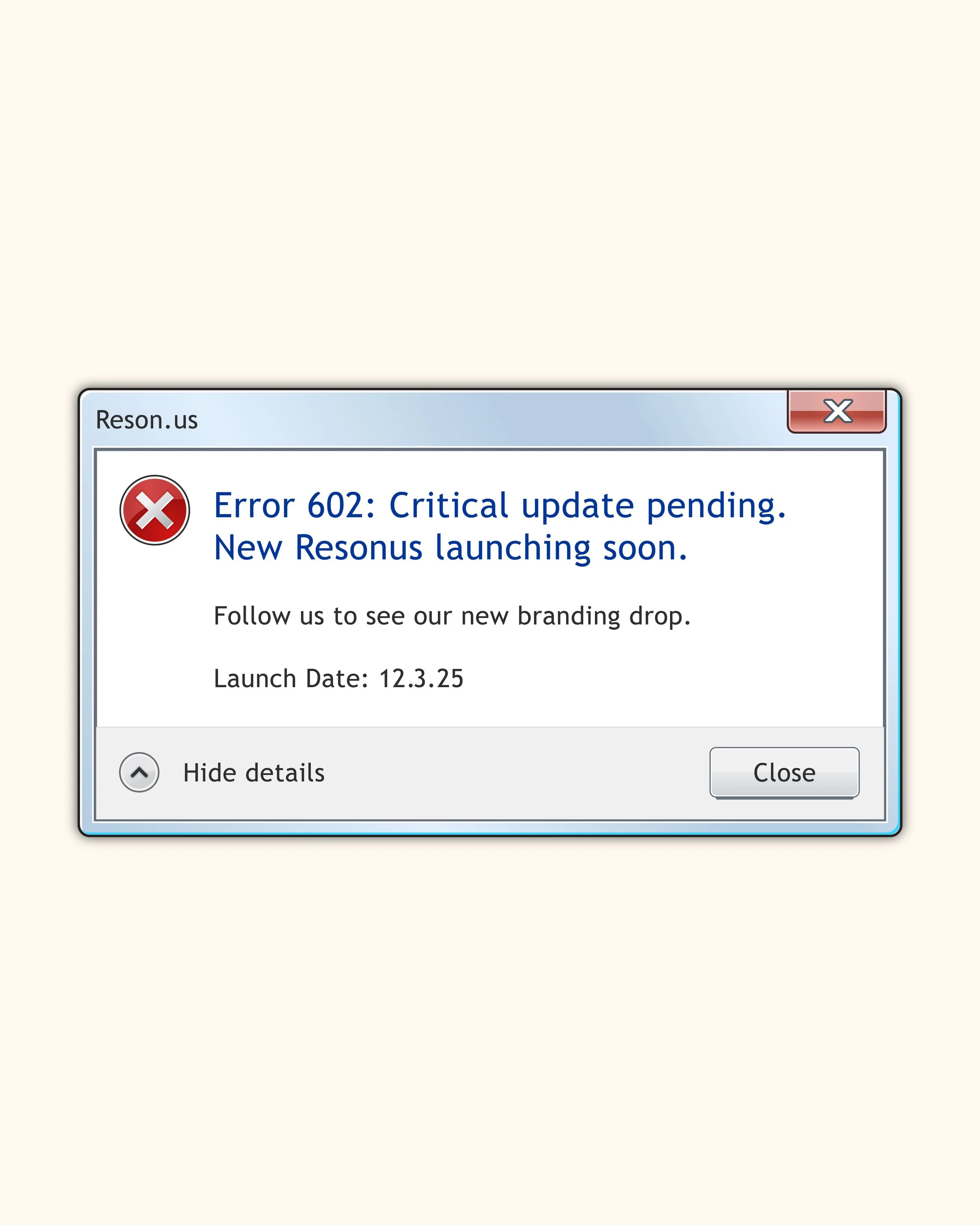
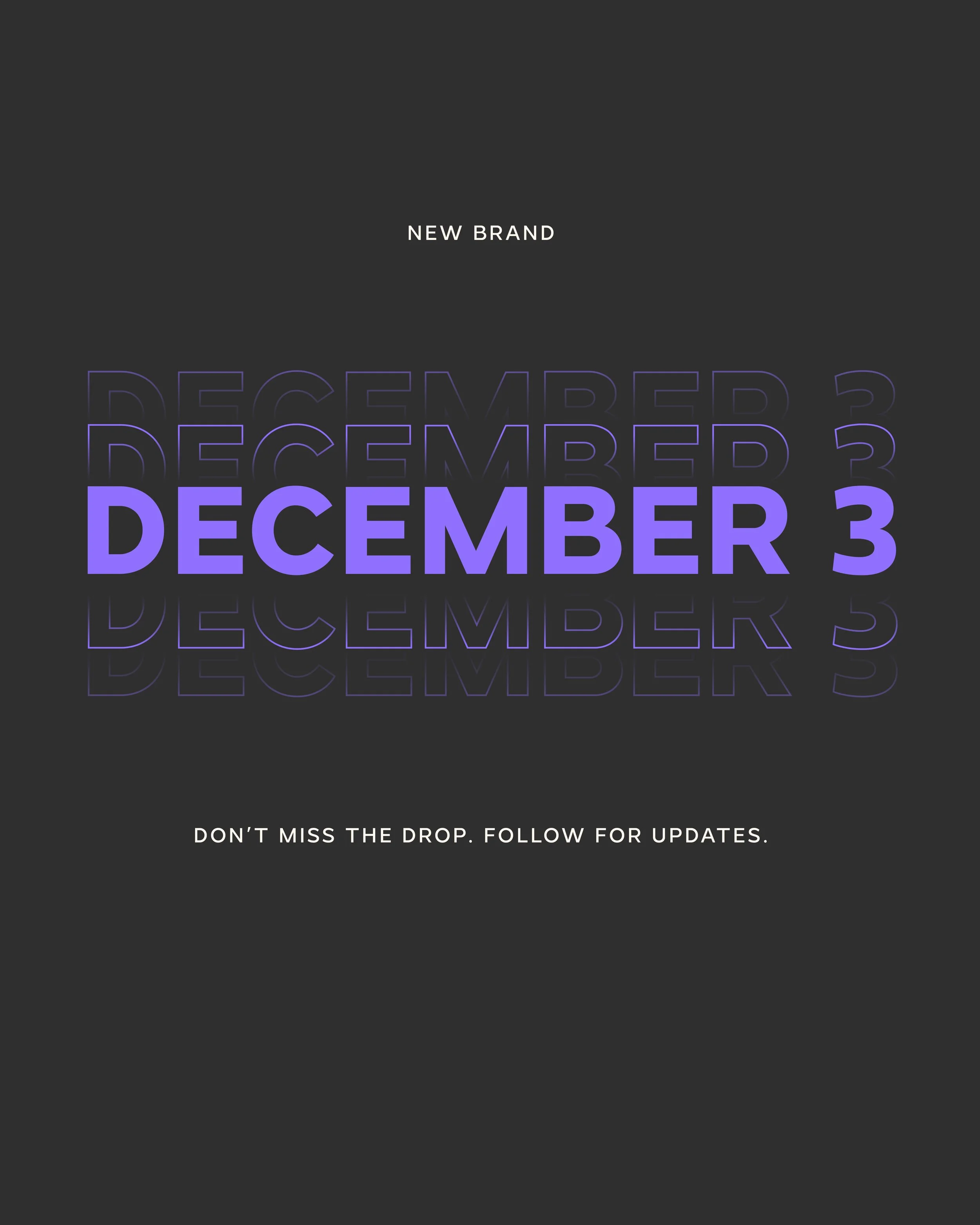
To kick off this new brand, we wanted to bring it into the world with the hype and awareness that it deserves.
So, we create a launch campaign to give our LinkedIn followers a heads-up that something exciting is coming soon.
The Reel Reveal
After launching this teaser campaign, we needed to make the official announcement live up to the hype and celebrate the new brand. I created this reel with a series of mockups set to Connor Price’s hit song, Too Easy. The tagline Resonus uses is “Simply Engaging,” so the catchy beat relates to how Resonus makes something that was obviously hard, now easy to be a part of.
Credits
Follow Resonus on LinkedIn
Impressed?
Want to give your brand the next level treatment? Then let’s get in, soon! My team and I work on only one brand at a time to ensure you’re getting the highest-quality design we can offer. To ensure this, clients must book a brand project in advance.
We’re now booking projects for 2026, availability fills up fast—don’t wait too long!